How we compare
We check our work against Publisher’s own PDFs
Many free .pub converters seem to run LibreOffice behind the scenes. We wrote our own page layout instead, so we owe you proof that it’s better. Here is how we measure, what we found, and where we still fall short.
The short version
Pages that match Publisher’s PDF
(15 files, score out of 100)
First page vs Publisher’s preview
(84 files, score out of 100)
Newsletters that repeat the same story on every page
We came out ahead on 14 of the 15 files that have a Publisher-made PDF, and level on 1. All 89 test files open without crashing, though a few of the oldest (Publisher 95 to 2000) give only Publisher’s small preview picture or almost nothing. 1502 deliberately damaged files caused 0 crashes or hangs. Numbers from our test run of 2026-10-11.
How we test, in plain words
- We collect real .pub files. 89 of them: newsletters, church bulletins, flyers, certificates, posters, cards and a few odd ones. They come from public bug reports, open-source test collections and research archives, saved by Publisher versions from 95 all the way to Microsoft 365.
- For 15 of them we also have the PDF that Publisher itself made. That PDF is the answer sheet: it shows exactly what the file is supposed to look like.
- We convert every file twice: once with PubToPDF and once with LibreOffice, the free office suite. As far as we can tell, many free online converters use LibreOffice behind the scenes, so it is the fair thing to beat.
- We turn every page into a picture and compare it with Publisher’s page, dot by dot. We count how much of what Publisher printed shows up in the same place in the copy (within about a millimetre on an A4 page), and how much the copy adds that shouldn’t be there. Those two numbers make the score: 100 means every mark is where Publisher put it, and nothing extra.
- For files without a Publisher PDF, we compare the first page with the small preview picture Publisher saves inside every .pub file. It’s blurry, but it still shows when whole blocks of text or pictures go missing.
- We look for repeated text. Newsletters often run one story through several linked text boxes. If a converter starts the story again in every box, the same paragraphs appear over and over. We count files where that happens.
- We try to break it. We feed the converter 1,500 deliberately damaged files and check that it never crashes or freezes.
File by file
Every file that has a Publisher-made PDF, with the lowest LibreOffice score first. Score out of 100; up to 8 pages per file are compared.
- WordArt and shapes sampler, 7 pages83 vs 42
- Parish newsletter, 4 pages (Italian)91 vs 80
- Club bulletin, 4 pages (French)94 vs 81
- Church bulletin, 2 pages90 vs 81
- Pedigree certificate with tables97 vs 83
- Flyer (French)97 vs 86
- Charity newsletter, 4 pages99 vs 88
- Brochure (French)94 vs 89
- Science poster (CC BY)99 vs 92
- Flyer, 2 pages95 vs 93
- Game cards, 20 pages (CC BY)99 vs 94
- Game cards, 30 pages (CC BY)99 vs 94
- Game cards, 26 pages (CC BY)100 vs 94
- Folded leaflet, 2 pages100 vs 97
- Note card100 vs 100
Show the same numbers as a table
| File | Pages scored | PubToPDF | LibreOffice |
|---|---|---|---|
| WordArt and shapes sampler, 7 pages | 7 | 83 | 42 |
| Parish newsletter, 4 pages (Italian) | 4 | 91 | 80 |
| Club bulletin, 4 pages (French) | 4 | 94 | 81 |
| Church bulletin, 2 pages | 2 | 90 | 81 |
| Pedigree certificate with tables | 1 | 97 | 83 |
| Flyer (French) | 1 | 97 | 86 |
| Charity newsletter, 4 pages | 4 | 99 | 88 |
| Brochure (French) | 2 | 94 | 89 |
| Science poster (CC BY) | 1 | 99 | 92 |
| Flyer, 2 pages | 2 | 95 | 93 |
| Game cards, 20 pages (CC BY) | 8 | 99 | 94 |
| Game cards, 30 pages (CC BY) | 8 | 99 | 94 |
| Game cards, 26 pages (CC BY) | 8 | 100 | 94 |
| Folded leaflet, 2 pages | 2 | 100 | 97 |
| Note card | 1 | 100 | 100 |
See the difference
These pictures come from files whose authors shared them under a Creative Commons licence, so we’re allowed to show them. Most of our test files belong to other people, so we don’t publish pictures of them. Tap or click a picture to see it full size.
Publisher’s own PDF (the target)
LibreOffice
PubToPDF
From “MuST: A Multiple Scattering Theory based Computational Package for the First Principles Study of Disordered Materials” by Yang Wang, Hanna Terletska, Ka-Ming Tam and colleagues, doi.org/10.5281/zenodo.6857213, licensed CC BY 4.0. Cropped and converted by us.
Publisher’s own PDF
LibreOffice
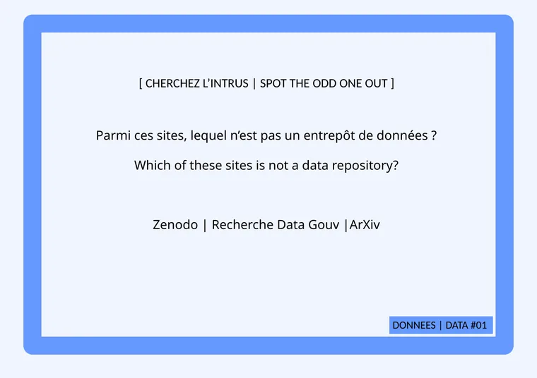
PubToPDF
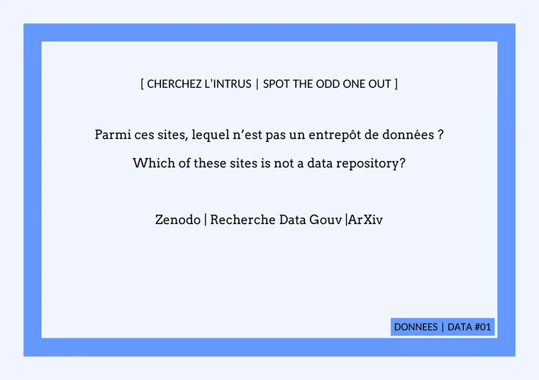
From “Jeu Open Science Pursuit” by Amandine Lustrement, doi.org/10.5281/zenodo.13904428, licensed CC BY 4.0. Page 2 of “Fiches questions – Données”, converted by us.
What we still get wrong
LibreOffice had a visible problem on 48 of the test files. We have checked our output for all of them, but so far only in a quick automated pass; a person still has to confirm each one. Most look fixed or now come with a clear warning, but some still go wrong:
- Fancy script titles on two greeting cards come out in a plain serif font instead of the handwriting style Publisher shows.
- Outlined or shadowed letters, such as white text with a dark outline, lose the outline, so white letters can vanish against a light background.
- Rotated text boxes on a poster (two test files) lose almost all of their text.
- Some bulleted lists lose their bullets, and one table cell on a small card is cut short.
- Curved WordArt (arches and waves) is bent to match by eye, so the curve is close but not exact.
- Fonts we can’t include are swapped for look-alikes. The text is the same, but lines can break in slightly different places.
When we know something didn’t come through, the converter says so on the file and names the page to check. Things we don’t know about can still slip by, so give important files a quick look before you print.
Why you can trust these numbers (and why you shouldn’t too much)
Honest limits. 15 files with a Publisher PDF is a small sample, and most of them are in English, French or Italian. We improved the converter while looking at these same files, so the scores may flatter us a little; files we have never seen could do worse. A dot-by-dot comparison also can’t tell a nice font from an ugly one, as long as the letters land in the same place.
On the other hand, the method is simple and the same for both converters: the same files, the same page pictures and the same scoring for LibreOffice and for us. We re-run it whenever we change how the converter reads or draws a file, and before we publish new numbers. LibreOffice was version 26.2.6, run with its standard settings.